R Basics: Plots
Keep building up the basics with some data visualization.
Friday, Nov 13, 2020 By Hope Snyder.
Let’s keep our discussion of the basics in R going by talking about some easy methods for data visualization. These methods should all come with with base R, meaning no extra packages are required to make these plots. However, to make them more visually appealing, extra packages might be required but these functions will at least get you started. I will be showing the output of the basic function without any formatting here.
Again, for these examples, I will use the mtcars data set that is installed along with R. Note, that in order to get access to just a single column or variable in data sets in R you use the $ symbol. For example, to get only the values of the mpg variable from the mtcars data set, use the code mtcars$mpg.
Frequency Plots
Let’s look at some frequency plots first. These plots are focused mostly on summarizing the data and showing the potential distribution of the data.
Bar Plots & Histograms
These two plots are very similar to each other. The main difference between them is the type of variable that they plot. Bar plots are for qualitative or categorical variables. Histograms are used when looking at the frequency of quantitative variables. It gives you an indication of the distribution of the variable. As with many of the basic functions in R, the function name is very similar to the procedure you want to run.
For bar plots, the function used is barplot(). However, before we can ask R to make a bar plot, we need to have the data in the right format: a table. The table needs to have the categories and the number of times that categories were listed in the data. Luckily that function also has an easy-to-remember name: table().
adj_data <- table(mtcars$gear)
barplot(adj_data)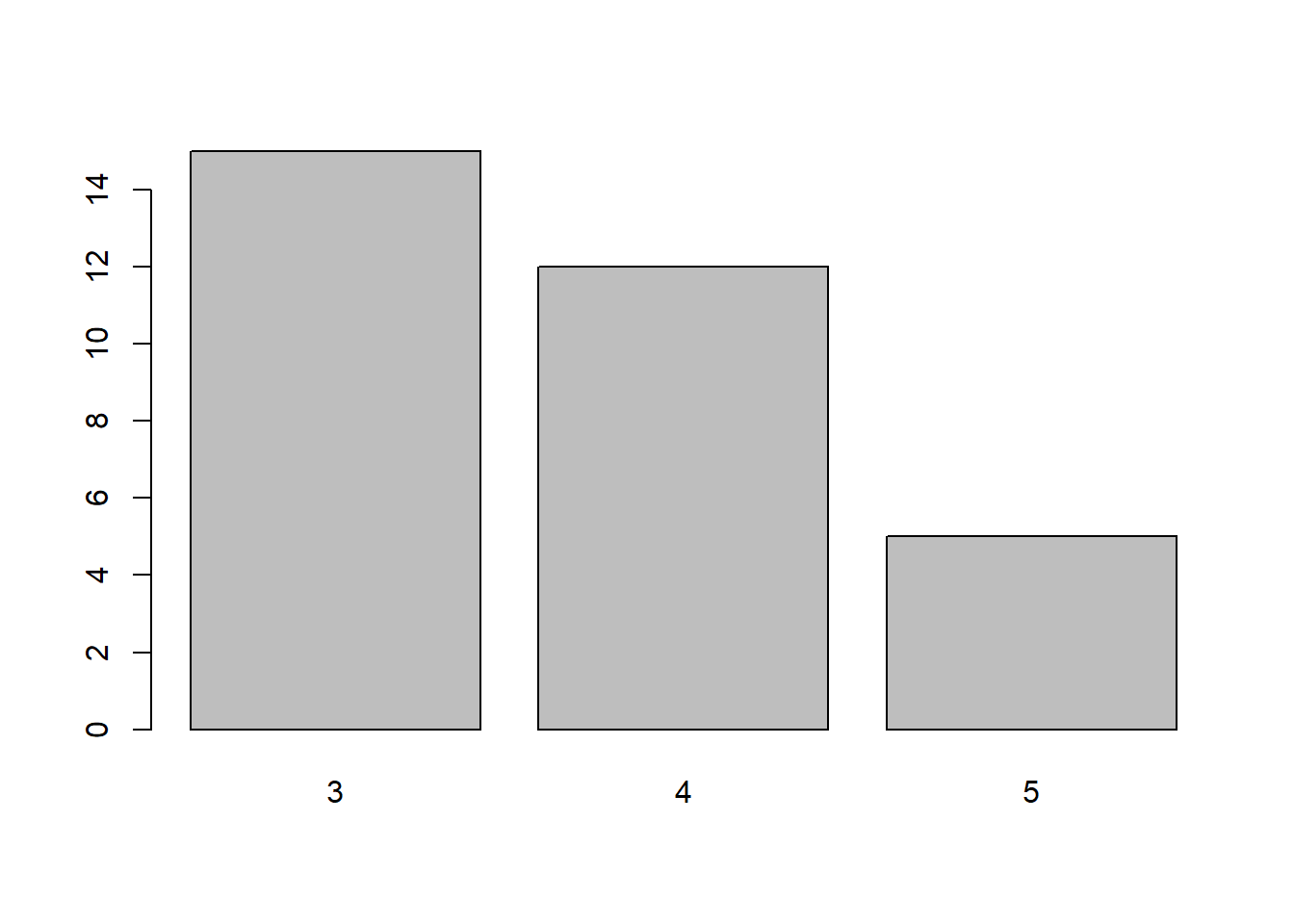
Now for a histogram the function is hist(). Histograms break the range of values into intervals and give the frequency of observations that fall into each interval. You are able to specify the number of intervals that you would like in the histogram using the argument breaks. You have a few options for defining the breaks in your histogram. Most often it will be either a vector of the breakpoints in the histogram or a single number for how many intervals to use in the histogram.
hist(mtcars$mpg, breaks = 10)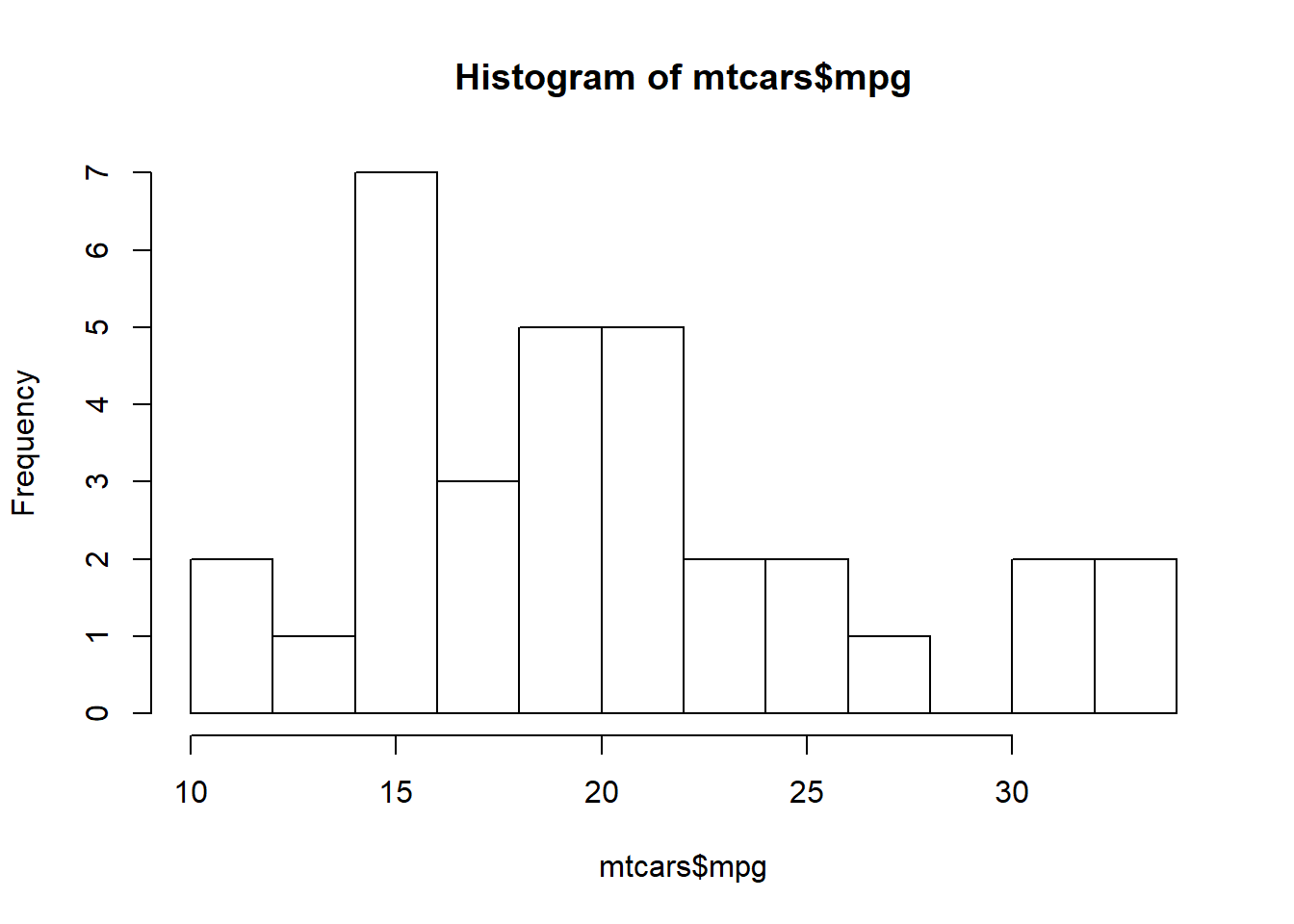
Density Plots
A density plot is like a smoothed version of a histogram, again showing an estimation of the distribution of the data. Two functions are used together to create a density plot: plot() and density(). Note that the plot() function will come back later.
plot(density(mtcars$mpg))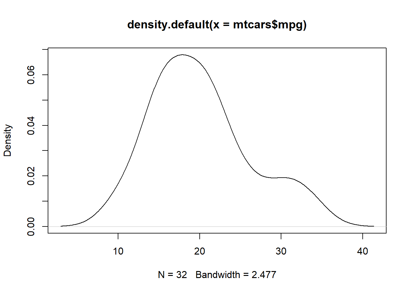
Box Plots
Box plots are good as a visual representation of the descriptive statistics of the data. It shows the median and quarterly values as well as the outliers within your data. The function to use is boxplot(). Note that you can have the box plots can be divided by groups using the ~ symbol.
boxplot(mtcars$mpg ~ mtcars$gear)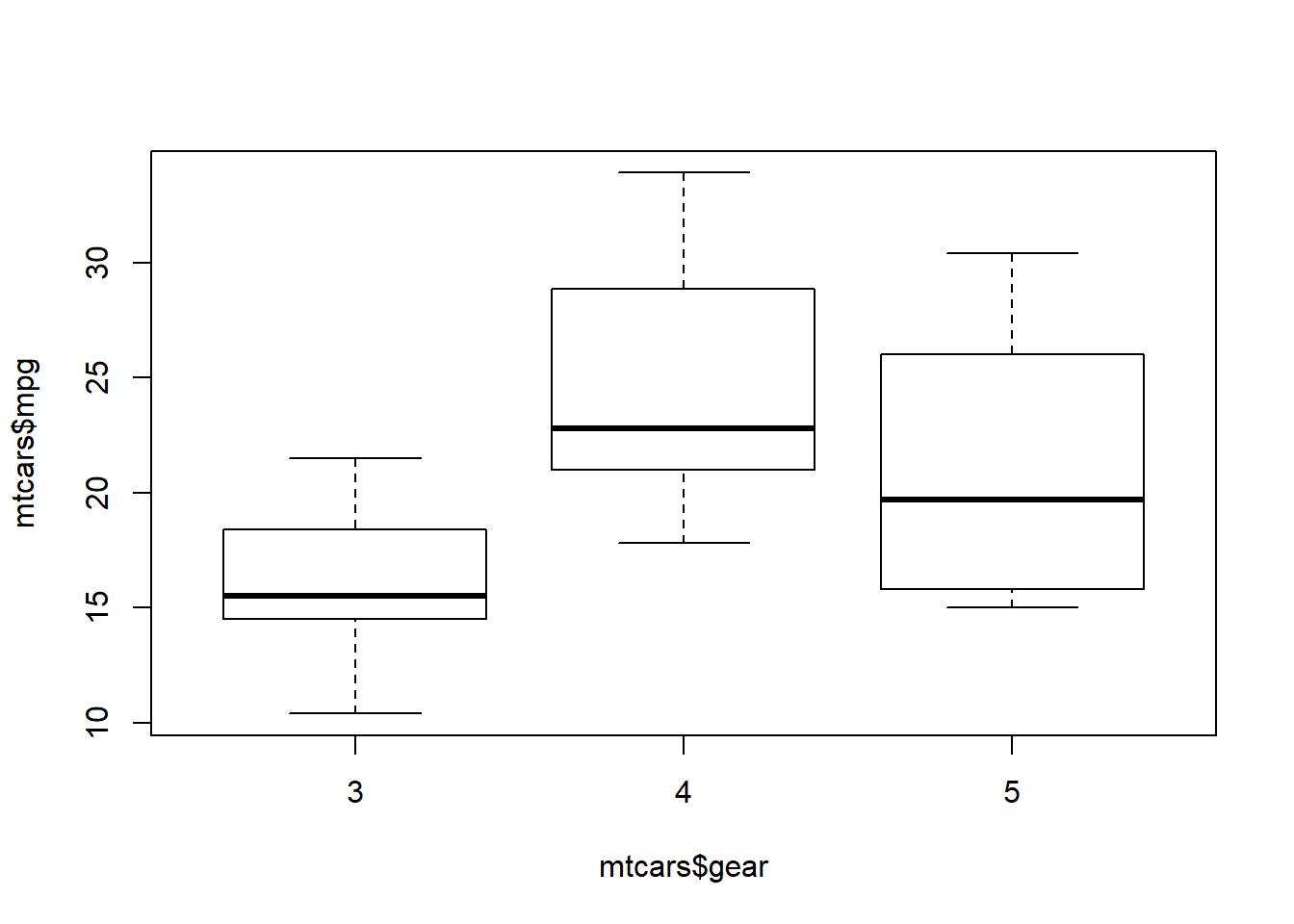
Testing Plots
Now let’s look at some plots that could potentially connect to statistical test. These plots can be considered as visual summaries of the results.
Line and Point Plots
These are used to visualize a singular variable, most often used when data collection also includes a time component. Here, we come back to the plot() function and include the argument type = "l" for lines or type = "p" for points. You could also have both on your plot using type = "b".
plot(mtcars$mpg, type = "b")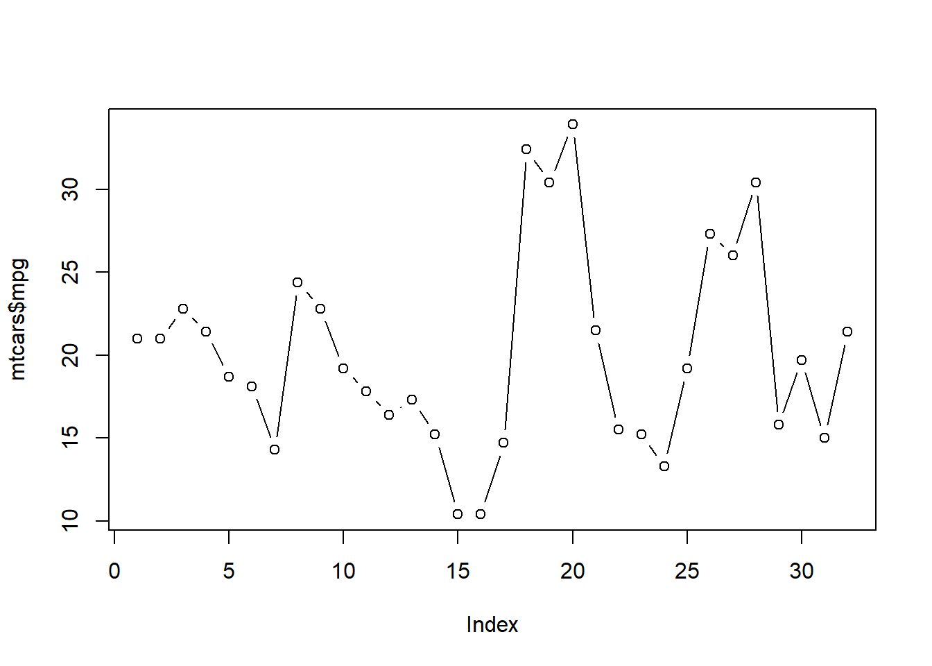
Scatter Plots
Scatter plots in R are formed again using the plot() function. This time two variables are listed as arguments. One for the x-axis and the second for y-axis. This helps to visualize a potential correlation between the two variables of interest.
plot(mtcars$mpg, mtcars$wt)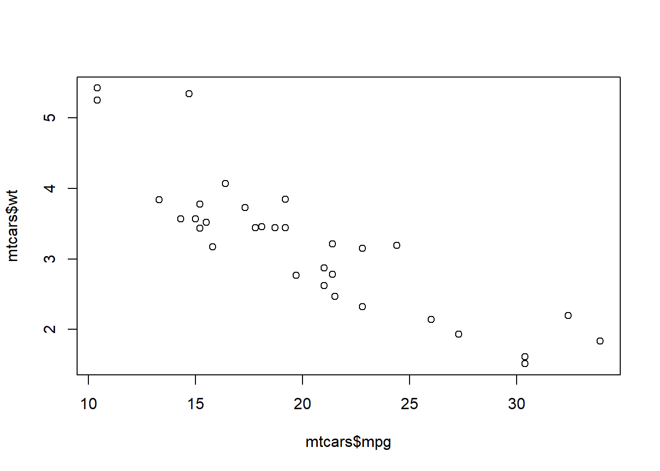
So far we have gone over basic statistics and plotting in R. But there is still more to go to build up the basic skills! We still have importing data and test statistics (for two groups or more). Join me next week for importing various data files into R.